[This post is by Chris Nesladek, Interaction Designer, Richard Fulcher, Interaction Designer, and Virgil Dobjanschi, Software Engineer — Tim Bray]
Along with our regular updates of the Android platform, we like to build example applications that showcase best practices for UI features and behavior patterns, to help our 3rd party developers create even richer applications.
For example, the Twitter for Android application that we worked with Twitter to design gives you, the 3rd party developer, a working example of how you can customize and build an application that’s both fun and highly functional. This blog post is meant to showcase these patterns along with some recommended implementations as you start to develop your applications around them.
Let’s get started and explore these patterns in more detail now.
Pattern 1: Contacts Sync with Address book at Sign in
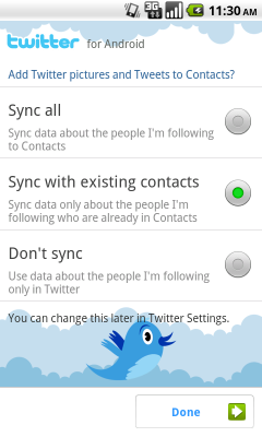
One of the most important intents we added to Twitter for Android was the ability to sync your Twitter contacts into the phone. This integration also allowed us to give Twitter users with an Android phone the use of the QuickContact widget, which gives users a choice of ways to contact their followers.
We recommend:
- Using this activity upon first signing into an application.
- If your app has no sign-in, showing this screen at first launch to improve discoverability of contact sync.
Pattern 2: Twitter account integration with QuickContact for Android
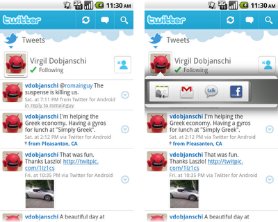
The good news for developers is you get this highly functional contacts feature for free if users choose to sync contact information into your app. QuickContact for Android provides instant access to a contact's information and communication modes. For example, a user can tap a contact photo and with one more tap launch a call, SMS, or email to that person. Other applications such as Email, Messaging, and Calendar can also reveal the QuickContact widget when you touch a contact photo or status icon.
Pattern 3: Dashboard
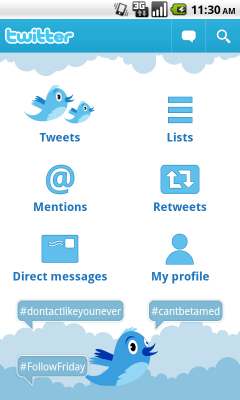
The dashboard pattern serves as a home orientation activity for your users. It is meant to include the categories or features of your application. We recommend including an Action bar on this screen as well.
The dashboard can be static or dynamic. For example, in the case of our dashboard for Twitter, we used the goodness of Live Wallpapers introduced in 2.1 to create an animated dashboard complete with real-time trend bubbles and the Twitter bird silhouette.
We recommend:
- Using this pattern to showcase the most prominent features of your app.
- Adding some unexpected delight to this screen, making it engaging without overwhelming the user.
- Exercising caution - for some apps, the user will want to jump directly into the meat of the application. For others, this sort of welcoming dashboard will be the right starting place.
Pattern 4: Action Bar

The Action bar gives your users onscreen access to the most frequently used actions in your application. We recommend you use this pattern if you want to dedicate screen real estate for common actions. Using this pattern replaces the title bar. It works with the Dashboard, as the upper left portion of the Action bar is where we recommend you place a quick link back to the dashboard or other app home screen.
We recommend:
- Placing an Action bar at the top of the screen to house the most common actions for your application that work across all activities.
- Using no more than 3 onscreen actions for the Action bar. Use the main menu as overflow for actions that are less important. The balance between Action bar and main menu will ensure the richness of interaction that is Android.
- Making the left-hand region actionable, offering one-touch return to your dashboard or other app home.
Pattern 5: Search Bar

The Search bar pattern gives you a fast way to switch between resources that are searchable by your application. For example, with Twitter for Android, we used the pattern to support searching within Tweets as well as People. When triggered, this pattern sits on top of the Action bar.
We recommend:
- You support suggestions.
- You keep a search history so users upon returning to the search activity can have quick one-button access to previous searches.
Additionally, you can feel free to use the Search bar selection mechanism as a replacement for tabs since it’s really just a fast pivot on a data set. If you have more than 3 data sets, tabs become problematic since no more than 3 can be onscreen at once. For example, look at how we implemented the Profile switching mechanism below:

Pattern 6: QuickActions

QuickActions is our newest UI pattern. Currently, it has been implemented as a fast, engaging, popup triggered by an onscreen UI element that identifies it in as minimally disruptive way as possible. We recommend you use this pattern for list views that are data intensive where items inside the list have contextual actions associated with them. QuickActions can be used as a replacement for our traditional dialog invoked by long press.
By choosing to use this pattern as part of a list, we made it easier for Twitter users to take action on the information in the list view by keeping the item and associated actions in context. We also took the extra step of making it easier to target links in list views by turning off the list view button element as a secondary component to making this pattern even more usable. This way users of Twitter for Android can view links with one tap and/or see the posted tweet on a map by tapping the tweet meta data directly.
We recommend:
- Creating a UI element that is minimal and recognizable as an action popup; either a frame around an image or an icon in a list item.
- Only using this pattern in applications where the data is intensive.
- Placing the action popup below or above the information you wish to allow users to take relevant contextual actions on. This will make it easier to associate the actions with the content in view.
- Turning off the entire list view button element so that regions can be easily targeted for the user.
Pattern 7: Companion Widget

The companion widget pattern is something we recommend all developers think about deeply. The widget you create should be more than a big button link into your app. Used correctly, it can provide a place on a home screen that personalizes, albeit in a small window, your application.
In the case of Twitter for Android, we designed and built small and large-sized widgets to support different types of functionality. Both widgets let a user view his/her tweetstream. However, the smaller widget hands off to the application to create a reply to a tweet from the stream, whereas the larger one gives direct access to the Tweet compose activity.
We recommend:
- Identify your application in the widget with a brand icon
- Make this more than a button into your app. Give your user an action or view into the app itself.
- Keep the activity stateful so that on exiting the application and re-entering a user is returned to the same context in the activity, minimizing the impact of using the dashboard if it is used.
Don’t think we quite got something right? As many of you know, we’ll soon be open sourcing this application code under the Android Open Source Project. We look forward to seeing what you can build starting from this code these UI patterns. In the meantime, Happy Tweeting!
Twitter for Android is available in Android Market for immediate download. It is compatible with Android 2.1/2.0 devices, with support coming soon for more.
Come check out the Android UI patterns session at Google I/O next week to learn more about how this applies across our framework and not just in the Twitter app.
 ☰
🔍
☰
🔍

 One of the most important intents we added to Twitter for Android was the ability to sync your Twitter contacts into the phone. This integration also allowed us to give Twitter users with an Android phone the use of the QuickContact widget, which gives users a choice of ways to contact their followers.


 Google Play


